I have noticed with every unit we have embarked on, I have taken a keen interest in each topic we are asked to research and develop.
This may already be obvious due to my previous posts but I felt the need to address it's importance!
The latest unit my frantic curiosity has chosen to pursue is 'Viewpoint'. Coming right after 'Typefaces and Letter forms', it has managed to keep hold of my attention and in doing so has made me feel aware of magazines, their purpose and how they are created.
My years subscription to GQ (Gentleman's Quarterly) is becoming more and more worth the money with each issue that arrives in the post. I can now appreciate the text and typefaces on the front cover, along with the content inside. I look at the cover for while before beginning the magazine. Just figuring out what they want you to take from the information they have displayed. It's always so glossy and sharp, not to mention the smell! But that's beside the point...
What I am trying to say, is that as well as the research and cutting and pasting into your sketchbook, I feel if you actually understand the system in which magazine design is held under, it will help you a lot more in the long run.
Here's hoping I'm able to display this enthusiasm and understanding in my work!
29 April 2014
3 March 2014
Visual Recording
After today and experiencing a more structured lesson in the studio I am happy with the amount of work I have completed. This unit in particular is an opportunity to develop and practice my skills in drawing from observation. Whether it be realising how perspective comes into play whilst drawing buildings, or how the depth of certain lines matter in still life drawing - I finally feel like them sticking in my brain.
Today after moving on from full arm length drawings of our chosen objects, the next stage was to hold the pencil in our usual drawing position. This allowed me to switch back to a more controlled way of drawing and funnily enough made me feel more able and confident about drawing from observation.
Today after moving on from full arm length drawings of our chosen objects, the next stage was to hold the pencil in our usual drawing position. This allowed me to switch back to a more controlled way of drawing and funnily enough made me feel more able and confident about drawing from observation.
Siobhan had mentioned a lot today about using tone and how hard we were pressing our pencil against the paper whilst drawing. I heard what she had said and decided to put it into practice. Once my shoe had been drawn I chose certain lines to darken, lines that I found were more important than others and right enough it gave my drawing depth and definition. It was suddenly brought off the paper and I was pleased and surprised at how a simple technique can change how effective a drawing looks.
Happy and perhaps a bit proud of my shoe, I continued working on tone and focusing in on other areas of shading. This is just one of a few examples of how little bits of advice have helped me improve my drawings, and understanding of different techniques.
Happy and perhaps a bit proud of my shoe, I continued working on tone and focusing in on other areas of shading. This is just one of a few examples of how little bits of advice have helped me improve my drawings, and understanding of different techniques.
4 February 2014
Helvetica
Watching this film in full is fascinating, and utterly brilliant. I am being taught so many things about the complex and detailed world of typefaces. The passion and energy that fuels graphic designers and type designers minds is inspiring.
There are so many typefaces i see every day, all the time, and they just pass me by. I think now, there is no getting away from it. The fact that the space between each letter, the white and the black all contribute to how you feel when you read a word or sentence is mindblowing!
It feels ridiculous that i haven't noticed until now, but it also makes perfect sense. Of course companies and their designers are choosing certain words to be printed in certain typefaces, of course they are! It feels as if i've been so ignorant all this time. There is no doubt in my mind that i realised at some stage in my life that advertising was this thing that gripped our attention from the word go, and made us spend our money and react in certain ways, that much was clear. I guess i just never had the inclination and reason to delve more into the mechanics behind it all.
If any of that makes sense, and i hope it does, i'll un-pause the movie and get back to broadening my mind.
29 January 2014
Artist Rooms: Louise Bourgeois, A Woman Without Secrets
I had no previous knowledge of Bourgeois or her work upon attending the exhibition, and so was intrigued and interested in what I was going to see.
After spending around an hour and a half slowly taking in the paintings and sculptures I had chosen one piece that specifically stuck out for me.
 |
| Ode a la Bievre, 2002 |
This was made by Bourgeois as a material book, based upon her memories and melancholic relationship with her childhood environment. These individual pieces reflect upon what her home town was once like, and how she remembers it. It was triggered by a visit she took with her own children to Bievre, on arrival she began to notice differences in certain surroundings, she has managed to convey her very sentimental reaction to this change through 25 archival dyed and lithographed images. They were completed using old clothing and combining text with an interesting collection of colours and images, Bourgeois has achieved an inventive piece of art very personal to herself. "witnessing the past through the present moment" Is how she put it.
I very much enjoyed the exhibition and will be returning before it's end as I feel I can learn a lot from this particular artist.
8 January 2014
Large Head
Large Head
Georg Baselitz - Woodblock and monotype on paper - 1966

I notice a lot of emotion in this piece. The aged face looks worn and fed up, the obscure shapes that cover his cheeks and forehead indicate pain perhaps. His small, almost squinted eyes seem to be staring out at something, deep in though indeed. I always like looking at portraits, I like to imagine what the person is thinking of at that moment or, why the expression on their face is that way. I like this print and although not the most complex or hard to actually produce physically - I think that a lot of energy went into conveying what this man was feeling.
Favourite Chair
Favourite Chair
Gillian Golding - Linocut - (year not found)
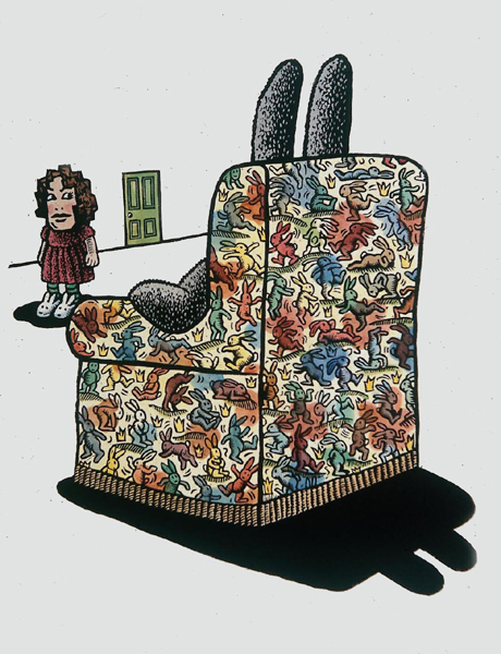
This ominous looking print intrigued me upon first glance. From what is visibly a human sized rabbit sitting in an armchair covered in smaller, more colourful versions of himself looks relaxed. The woman stood a fair bit away in rabbit slippers is staring across at him, with a green door even further away. It's hard to tell what the woman is feeling or thinking, but what I find interesting about this print is how the rabbit is facing away, we are left to imagine the expression on this huge rabbits face, and I can only imagine it looking either smug or upset. Again, with some of the other prints I've looked at I am amazed at how much effort and concentration that must have went into making this print. In particular the intricate patterns upon the armchair, I am also impressed with the composition and structure of the objects. I like this print, and the way it makes me feel, it activates my imagination and grabs my attention.
4 December 2013
The Wallet Begins to Empty
 |
| The Wallet Begins to Empty, 1961/63, David Hockney |
After exploring Hockney's 'Rake's Progress' this particular print jumped out at me. At first glance I was able to identify (roughly) what was going on. Referring to the title this man is being banished, or sent off, or maybe fired by what looks like superiors at the top of the set of stairs. The red splodge hanging in mid air around the dejected figure walking down the stairs appears in at least 2 other of Hockney's pieces in 'Rake's Progress'. I feel this may be connected to emotion that each figure is feeling within the prints. The fact this man's wallet is beginning to empty may be the reason for being ostracised from what looks like at the top of the stairs alongside the angry figures, the Washington Monument.
I like this print. It conveys (as I have perceived it) a simple message that Hockney may be getting across, and through simple objects and colours within the print, he definitely achieves this.
Leonardo Da Vinci - The Mechanics of Man
In late October of this year I visited the Queen's Gallery in Edinburgh. I had heard through a friend that Leonardo Da Vinci's work was on display and was eager to witness his masterpieces first hand. The exhibition did not disappoint. I went along with said friend Flora, who also has a keen interest in the art world.
'The Mechanics of Man' hosted the original collection of investigations Da Vinci took out on many cadavers later in his life. He was/is lesser known for his studies on human and animal anatomy, which became increasingly important to hum up until his death.
We spent just over 2 hours walker around the gallery reading, looking at and just appreciating all the work that was on display. All this work wasn't published until hundreds of years after his death. Personally I was in awe for most of the visit, I had no clue a man who I had assumed was a very famous artist, sculptor, etc. He was something much more. To explore this in depth study of the different parts of the human body was simply astounding.
Flora and I, quietly whispering confirmed our mutual wonder whilst staring at these artistic drawings of the shoulder muscles, forearm tendons, right down to each little bone in the hand. I couldn't believe I was getting to see these ancient works of art for the mere student ticket price of £5.70. We stayed as long as possible and afterwards I purchased the 'Mechanics of Man' book that was in the gift shop, which was a printed collection of each of the 93 drawings in Da Vinci's experiments.
Attending this exhibition has been added to the ever growing list of things I am looking for and discovering since joining this course. I plan to visit as many exhibitions as possible in the future as I believe the only way to expand my creativity and inspire me to create my own work is to explore many other artists work as much as possible.
Olympic Robe
 |
| Jim Dine, Olympic Robe, 1998 |
The fact there isn't a person filling this colourful, ragged looking robe is interesting to me. Especially considering the pose it is displaying is that of movement. Hands on the hips suggest emotion. The lithographs title is conveyed on the bottom part of the robe which is the Olympic rings. The scrappy edges around the print is what I mostly enjoy about it, the sense of pride I feel this print is trying evoke is striking. The body language on display has connotations of success. The more I have looked at this particular print of Dine's, the more I like it.
2 December 2013

Subscribe to:
Posts (Atom)